Today I would like to talk about how to use your own Style in SXA. For those who have never had the opportunity to work with SXA, it is a very powerful tool for creating standardized sets of layouts and components based on recommended practices that can be used across multiple sites.
When we talk about styles in SXA, we first need to start by talking about Themes. Using Themes, you can define the appearance of a site without having to change the site itself or its content.
When you install SXA, you may notice that it already comes with a default Theme, called Wireframe, to help you get started. However, it is possible to create a custom Theme for the site that you are working on. Any new theme that you create will inherit from the default Theme.
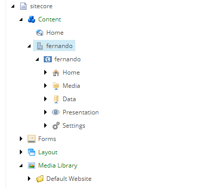
By right-clicking the Content node, I created a Tenant and a site called Fernando. (Tenants are a feature of SXA).
After creating my site, SXA automatically created a folder with the name of my website inside Media Library -> Themes. As stated above, it already comes with Wireframe (default Theme) created.
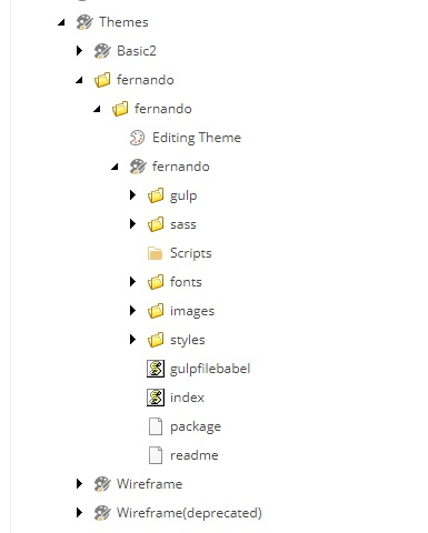
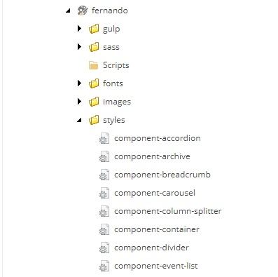
SXA will automatically break new themes into folders with necessary scaffolding items. If we open the style folder, we can see the classes that have already been created by the SXA separated by components and functionalities.
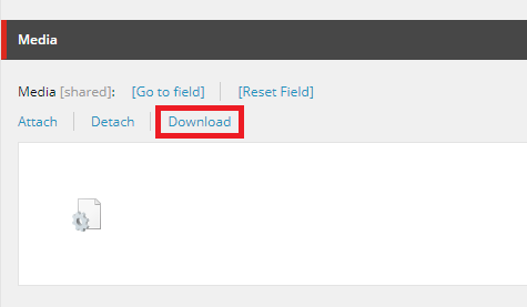
Let's start with a simple example, in which we change the background color of an image. For this, we will open the class corresponding to the image component (later I will show where it does the css link with the component). An easy way is to select the component you want to change (component-image) and search the field Media and download it.
I just opened the .css file and created these two simple classes, one to paint the background in black and the other to paint red. After changing, we will click Attach to upload the changed file.
.image-techguildsblack img {
background-color: black;
}
.image-techguildsred img {
background-color: red;
}
Now comes the coolest part in my opinion, where we make the connection of the class I created with the component.
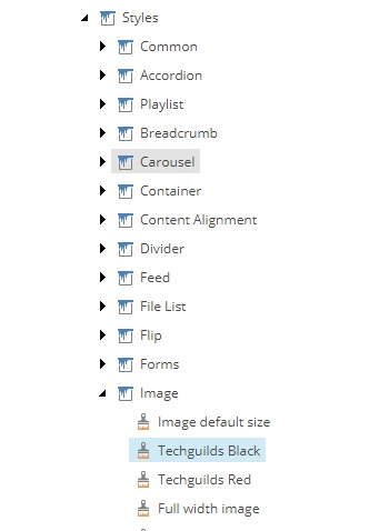
Let's open our site in Content root and navigate to Presentation / Styles. Here we’ll link our class to our component. Every Component has its own Style item underneath the “Styles” node. In here, right-click the “Image” component to add new Style items.
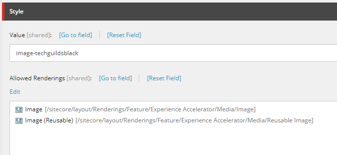
After we create a Style, we have to fill the “Value” field with the proper class name. In the Allowed Renderings, select the components to which the class will apply (here we selected the Image component).
After saving everything, lets open our page through the Experience Editor. In the XPE, I just selected Image through the SXA Toolbox, I added an image in the data source and went on to edit the properties of the component.
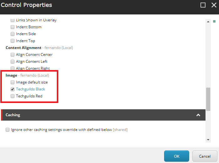
Inside control properties we go down to Styling. In the Image session we can see the two Styles we created in the previous step.
After clicking save, our background changes to black.

Switching to Red in just one click.

Thanks for reading! I hope my guide on customizing styling with SXA was been helpful!