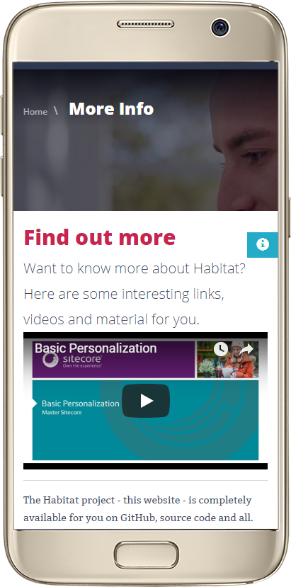
Recently we had a content author who had embedded some YouTube videos onto their Sitecore pages and visited them using their mobile phone. Much to their dismay, the video wasn’t responsive and was cut-off to the right of the screen.

At the time of this writing, YouTube didn’t have a responsive embed code that we could just copy and paste so we took to google and found Embed Responsively, who makes it easy.
Now, TechGuilds as a Sitecore Implementation Partner with many Sitecore Craftsmen and developer expertise could have coded something to make it work, but wanted to give our client a fast and self-sufficient solution. Besides, we didn’t think it was necessary to reinvent the wheel and cost our client valuable time and money.
All-in-one Responsive Embed Option
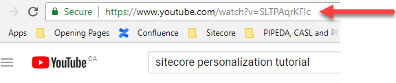
- From YouTube, copy the Video URL you want to embed on your page. (Don’t use share; it’s not required for this)
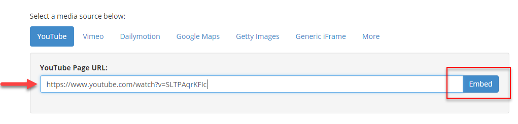
- Visit www.EmbedResponsively.com and paste the URL into the input box and click the Embed button.
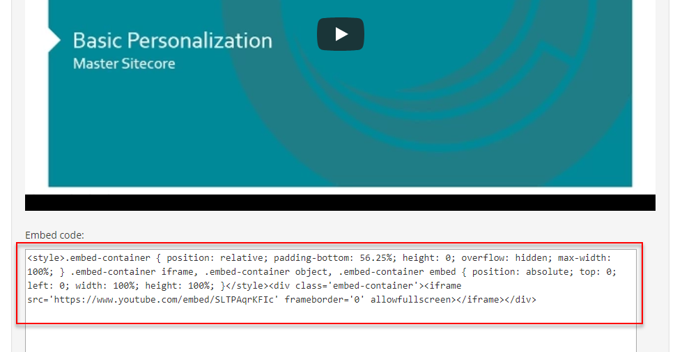
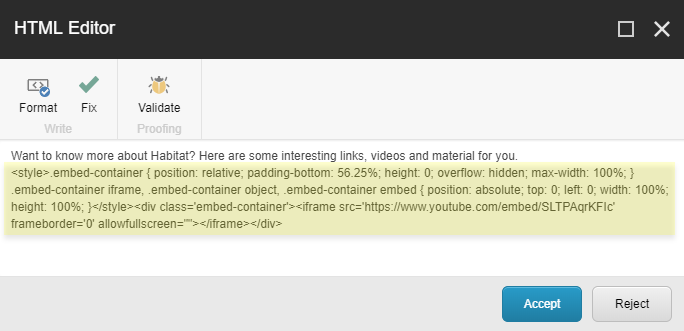
- At the bottom of the displayed video, copy the style-based embed code.
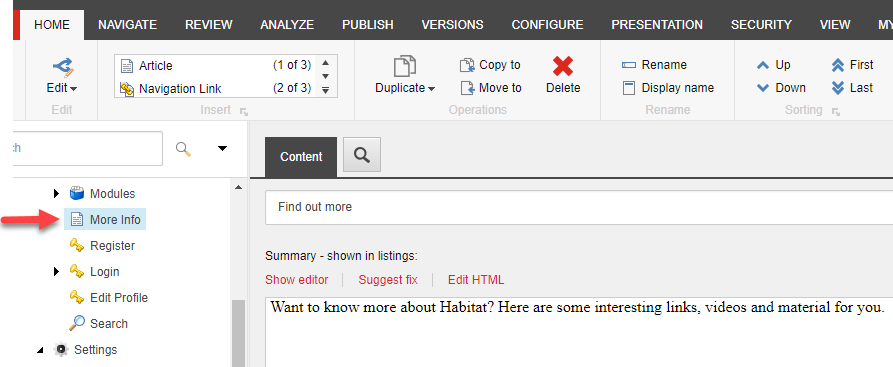
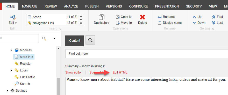
- Log into the Sitecore Content Editor and select the page on which you want the video embedded.
- Open the Rich Text field in HTML mode by clicking the Edit HTML option.
- Position the cursor where you want the video to appear on the page and paste in the embed code.
- Accept, Save and Publish your page and test on your mobile or emulator within your browser.
That’s it! Quicker and easier than writing this blog post 😊
Advanced Option
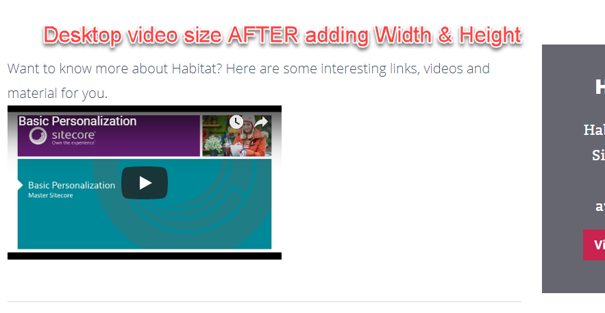
If you would like the ultimate control over the video so that it is a specific width and height on the desktop, and is still responsive on the mobile, here is how:
- Follow Steps 1 to 6 above.
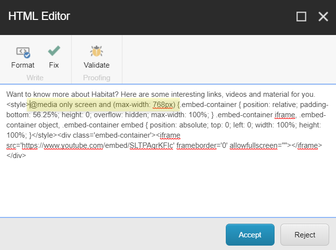
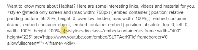
- Copy the following code “@media only screen and (max-width: 768px) {“, without the quotes
- Place it after “<style>” and before “.embed-container” of the responsive code.
- Add a closing curly brace “}” after “height: 100%; }” and before “</style>”.
It should look like this “height: 100%; }}</style>” with two curly braces before the closing “</style>” tag.
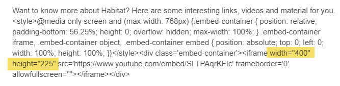
The mobile version will remain responsive, but the size of the desktop video changes.
|
|
|

Until next time, if you haven’t already done so, check out our productivity for marketers and content authors series.
Addendum:
Since this article was originally posted, we had a request on how to embed responsive YouTube videos on AMP (Accelerated Mobile Pages). Thank you Sitecore MVP Nabil Orfali for the code:
<amp-youtube width="480"
height="270"
layout="responsive"
data-videoid="lBTCB7yLs8Y"
autoplay>
</amp-youtube>