
I have been working with Sitecore clients on projects involving mini redesigns of user experiences to improve engagement and drive business value, and I thought it could be super helpful to share what goes into these UX upgrades for the benefit of teams tackling similar missions.
This post specifically addresses the improvement of website navigation, so read on for tips, recommendations, and considerations that will help you make informed decisions when collaborating with a UX partner or managing these enhancements internally.
What makes a good navigation system
Website navigation refers to the elements within a website that allow users to move around and find content. These elements include link text, buttons and most importantly navigation menus, the topic of our focus here.
Primarily, navigation serves the crucial function of enabling users to easily and intuitively locate desired information with minimal friction. But that’s not all it does. Think of this: a navigation system is not created in vacuum. It’s based on the website’s structure and information architecture (AI). It is, in a sense, the visible part of a websites IA, and therefore, it should aid visitors in understanding and visualizing the relationship between the different sections/pages of the website.
"AI is the structural design and organization of content within the site: how information is categorized, structured, labeled, and presented to users. It's essentially the blueprint that determines how information is arranged and accessed."
In addition to that, navigation must adhere to standards and requirements, such as accessibility and responsiveness. If a navigation system fails to meet any of these criteria—efficient and intuitive wayfinding, clear structure, accessibility, or responsiveness— it’s probably due for a redesign.
Navigation Menus
Menus—lists of links to other web pages—are integral components in navigation systems. They commonly appear horizontally in page headers, vertically in sidebars, or nestled within footers. Let’s look into each of these, one by one.
Horizontal Navigation Menus
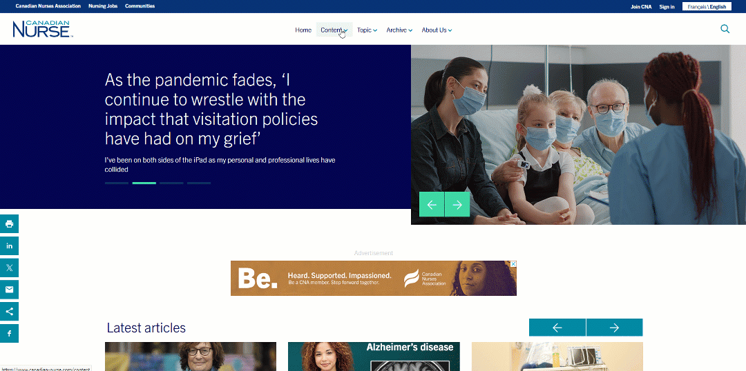
Horizontally placed menus in headers are probably the most common for global navigation across websites. The number of pages/links informs the appropriate type of horizontal menu.
- In smaller websites, the menu could consist of direct links -each item in the menu directs the user to the relevant page- but the majority of Sitecore websites don’t fall in this category.
An example of a horizontal navigation menu - Larger websites with more pages that can fit in a single line horizontal menu necessitate dropdown menus or mega menus. Because mega menus can accommodate a larger number of links and reveal lower-level site pages at a glance, they are generally considered the better option.

"Mega menus are a type of expandable menu in which many choices are displayed in a two-dimensional dropdown layout."
But what happens when the navigation hierarchy gets too broad to fit in a horizontal navigation bar at the top of the page? Clue: using small font sizes, cramming items close to one another, shortening the labels so they fit batter, or regrouping links to reduce the number of the top-level categories are terrible, terrible ideas. This is where vertical sidebar navigation comes in.
Vertical Sidebar Navigation Menus
Vertical sidebar navigation menus can accommodate as many navigation links as needed. They remove the visual design constraints inherent in horizontal menus. They also scale more easily in case of future growth. The vertical alignment of navigation items helps with scannability, and users are quite familiar with this type of navigation in desktop apps. Moreover, vertical menus translate smoothly to mobile. There is a reason why vertical menus are gaining popularity in e-commerce websites and beyond.
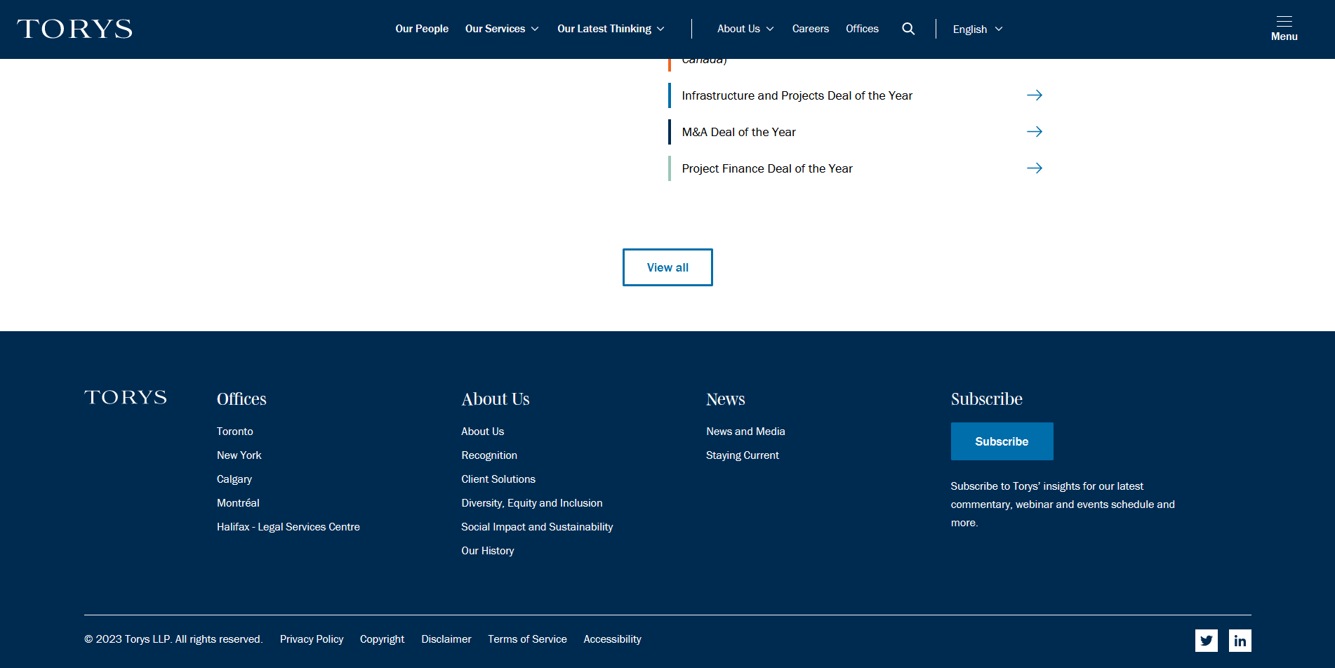
Footer Navigation
Footer navigation complements main navigation menus and offers users an additional way to find the content they are looking for without having to scroll all the way back up. Generally speaking, footer navigation should reflect a similar and relevant grouping to that of the main menu, but it can also include additional options not found in the main menu.
Utility Navigation
Utility navigation includes secondary actions and tools, such as register, sign-in, change language, etc. These activities are generally not part of a website’s hierarchy and are therefore placed as such, usually at the top right corner of the page (eyebrow). These are not the focus of this article. However, some guidelines around main navigation menus do apply for utility navigation menus.
How much is too much
Many resources on the web would tell you that the number of top-level navigation items should not exceed seven. While it’s generally a good idea not to overwhelm users with too many top-level navigation options, it is okay to exceed 7 navigation items. You just have to plan for it and execute in a way that makes sense (see vertical navigation menus). If you ever find yourself having to choose between listing more than 7 navigation options and changing the information architecture to fit all the options into 7 categories, I say choose the former.
Labeling
The best approach to labeling is to use clear, descriptive labels. It’s often tempting to use brand-focused terminology for labels—terms that are used creatively and distinctively within the brand but may not be used the same way by the audience. As creative and fun as it may sound, this approach is not customer-centric. Using simple terms familiar to the audience makes navigation predictable, and visitors would be able to tell the meaning of every navigation option and expect where it will take them before interacting with it. This makes for a far better navigation experience.
I personally don’t prefer A/B testing navigation labels on a live website because I strongly believe that labels should, above all, serve findability. When there’s reason to believe there are any findability issues, these should be identified and addressed before performing live A/B testing, preferably through user testing. This excludes call to action (CTA) copy, which I see no problem in A/B testing on a live website.
Visual Design Tips and Recommendations
When it comes to visual design, here are a couple of tips to guide you through reviewing, evaluating, and choosing options:
- Make menu links look interactive. Megamenus sometimes include some clickable elements and non-clickable ones -like grouping elements. Ensure it’s easy for the user to distinguish between the two at a glance.
- Tell users where they are. There should be a visual cue within the menu that shows the user their location within the website.
- Make labels easy to scan. Try to avoid all caps if possible, front-load key terms in labels if applicable, and left-justify vertical menus to reduce the time users spend reading menus.
- Avoid excessive animation. Resist the temptation of using elaborate animation. It might look cool, but usability comes first. This leads me to the last point.
- Follow Established Standards. Don’t try to reinvent the wheel or impress users with effects that don’t improve utility. Website navigation is more about usability than creativity.
Remember, there is no one right way
There is no one right way to design a navigation system. What works for one website and its audience may not work for another. I hope this post brings you one step closer to finding what works best for yours!