Your landing page as like the storefront of a shop. The display in the window has to stop people in their tracks and invite them inside. It’s all about showcasing the best of what you offer—without overwhelming visitors—and guiding them smoothly to the checkout. Everything needs to be clear, attractive, and easy to navigate. This guide will show you how to build a landing page that turns window shoppers into customers.
Key components every successful landing page needs
When thinking about the elements of a landing page, it’s good to remember the primary goal: driving visitors to take one specific action. This could be downloading a resource, signing up for a webinar, requesting a demo, or making a purchase. The best landing pages focus on a single, clear objective and are optimized to eliminate distractions, guiding visitors toward that goal.
Clear and compelling headline
- Craft a headline that immediately communicates your value proposition.
- Ensure it's relevant to your target audience.
- Keep it concise and attention-grabbing.
Persuasive subheadline
- Expand on the headline with a brief, supporting statement.
- Highlight key benefits or urgency if applicable.
- Use language that resonates with your audience's motivations.
Engaging description
- Reinforce the benefit stated in the headline, offering more reasons why visitors should take the desired action.
- Be clear, using simple language that motivates action.
- Create a sense of urgency with time-sensitive offers or highlight scarcity, if applicable.
Supporting visual elements
- Include high-quality, relevant images or videos.
- Ensure visual appeal by avoiding clutter and making effective use of white space.
- Guide the eye toward important elements, maintaining consistency with the offer or theme.
- Optimize visuals for fast loading times to avoid slowing down the page.
Social proof
- Showcase the value of your offer by displaying logos of recognizable clients, certifications, or awards.
- Build credibility with data—such as numbers of users, customers, or downloads.
- Position social proof near CTAs to reinforce trust at key decision points.
Form to capture information
- Minimize the number of fields and only ask for essential information. Fewer fields lead to higher completion rates.
- Reduce friction by using dropdown menus or radio buttons instead of open text fields, and implement auto-fill functionality.
Clear call-to-action (CTA)
- Make your CTA button visually stand out.
- Use action-oriented, specific language.
- Place CTAs strategically throughout the page to capture visitors’ attention at key moments.
Key Considerations for Optimizing Your Landing Page
- Concise Copy: Use short, impactful language that’s relevant to your target audience.
- Minimize Navigation: Focus user attention on the main conversion goal by limiting distracting navigation elements.
- Sticky CTA: For longer pages, consider using a sticky CTA that stays visible as users scroll.
- Personalization: Where applicable, tailor the content and copy to specific users for a more personalized experience.
- A/B Testing: Test headlines, CTAs, images, and form layouts to optimize for better conversions.
- Page Speed: Ensure the landing page loads quickly to prevent drop-offs.
- Accessibility: Make sure the page complies with accessibility standards to cater to all users.
Real-World Landing Page Examples and What Makes Them Work
The following examples showcase landing pages that successfully drive conversions and engagement, all powered by Sitecore. Let's dive into what these landing pages do right and how their design, copy, and strategy align with best practices.
Plan International Canada: Until We Are Equal

What’s great about it
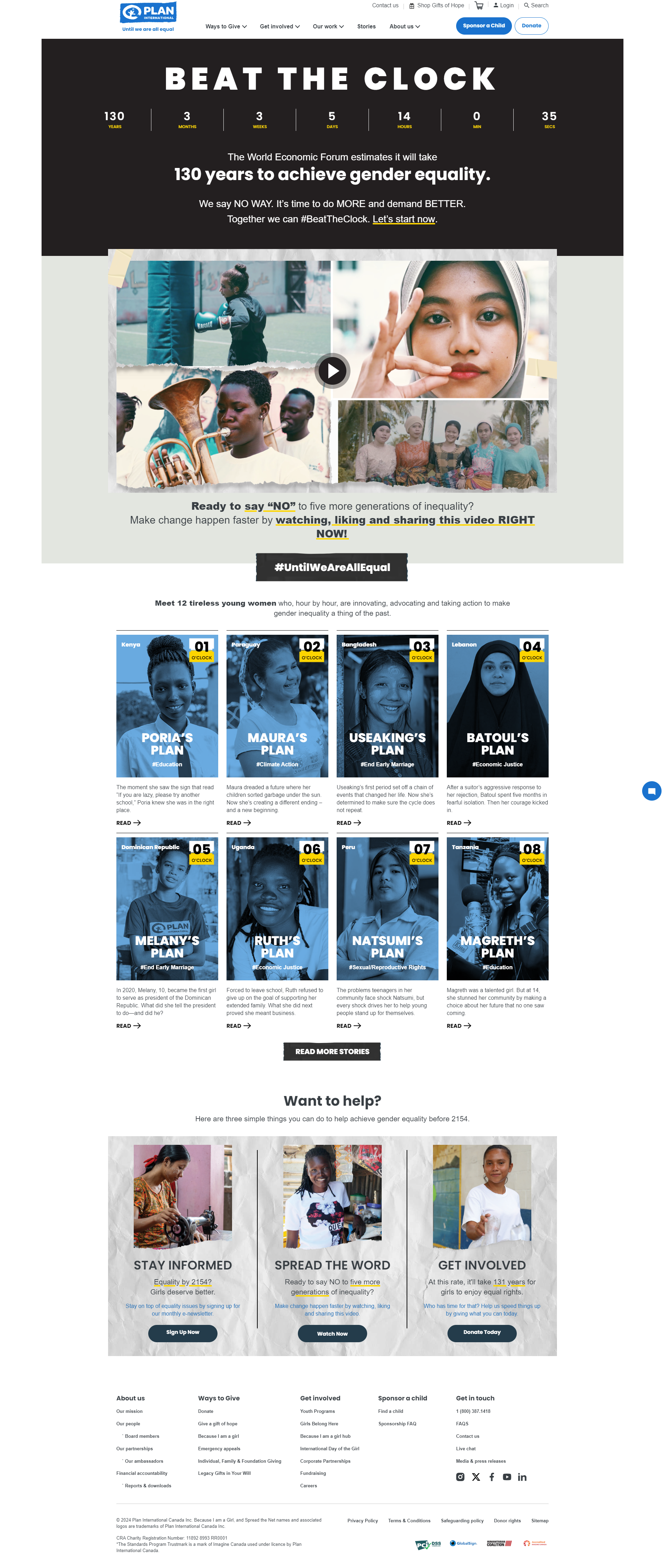
- The page immediately grabs attention with the bold headline, "Beat the Clock," evoking frustration over the 130 years it may take to achieve equality. It urges users to take action to accelerate progress.
- The clever use of the counter in the hero banner is outstanding. While counters typically count down to signal urgency, this one highlights how long it's taking to reach equality, sending a clear message that, without action from the world, including the users, change will remain too slow.
- The visuals are powerful and thoughtfully crafted. The imagery portrays girls from diverse backgrounds being empowered, instilling hope and reinforcing that users’ actions are valuable and will make a real difference.
- The video is highly effective, capturing attention with a strong hook, building empathy through storytelling, creating a sense of urgency, and then offering hope, all leading to the call to action: "Help us today!"
- Every element on the page guides users through a journey, culminating in a call to action where they can contribute through donations.
American Bankers Association Annual Convention

What’s great about it
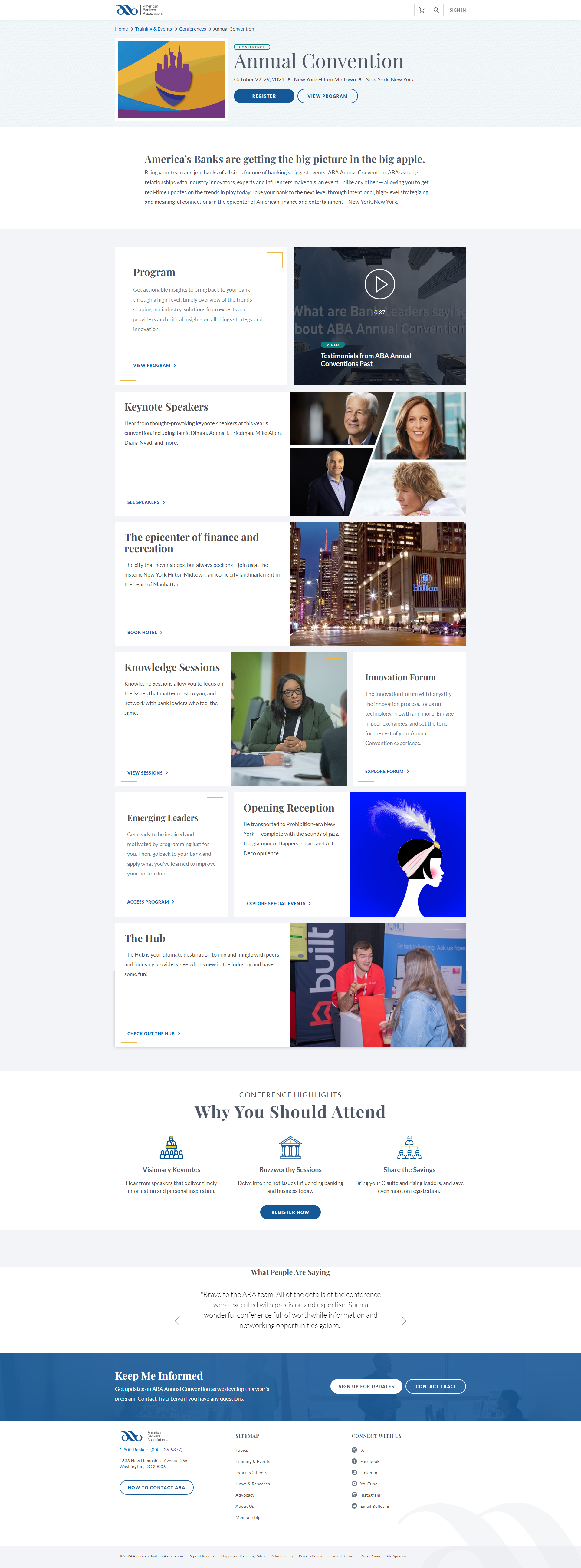
- The page features a clear headline, "ABA Annual Convention," communicating the event's purpose and inviting visitors to register.
- Just below the headline, the description highlights essential details like dates and location, an good example of providing critical information upfront without overwhelming visitors with text.
- The call-to-action buttons stand out with strong color contrast, making them instantly clear and accessible as soon as you land on the page.
- Navigation is minimal, with the main menu removed and only breadcrumbs visible, ensuring the user's focus remains on the convention content.
Creating an effective landing page is about clear messaging, strategic structure, and seamless functionality. Whether you’re guiding visitors to make a purchase, sign up for a service, or simply join a mailing list, each element plays a crucial role in driving conversions. From compelling headlines to optimized CTAs, every piece must work together to create a focused, user-friendly experience. As the examples powered by Sitecore show, blending the right tools with best practices allows you to deliver targeted, engaging experiences that resonate with your audience and leads them to take action.


