How many times have you -when buying a gadget- opted for the higher-end model because of all the cool bells and whistles it had and then ended up using only a few? I know I have more than I care to admit. It happens. And not only when buying your latest camera, smart watch, or home audio system. If your brand is using Sitecore as a digital customer experience platform, chances are you are using only a portion of what it is capable of. The good news is, we have a series of posts that will help you tip the scales and get you well on your way to be a power business user of Sitecore. This post is part of the series and is dedicated to getting you started with Sitecore’s Path Analyzer.
What’s Sitecore Path Analyzer?
The Path Analyzer is an application that creates maps as visual representation of the different paths that users take as they navigate through your website. It allows you to analyze these paths and identify the efficient and not-so-efficient ones, as well as the ones with potential for optimizations. It is available out of the box in Sitecore Experience Platform (XP) versions 8 and up.
How to access Sitecore Path Analyzer?
The Path Analyzer is one of Sitecore’s marketing applications. To access it:
- Log in to Sitecore
- In the Launchpad, under Marketing Applications, click Path Analyzer
A walk-through of Path Analyzer
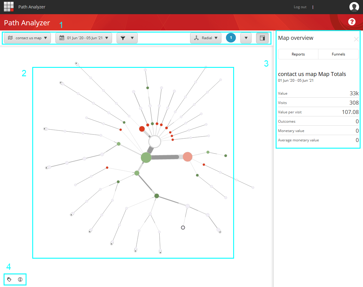
As you open the Path Analyzer, you’ll see:
- The control bar where you can select a date range, apply filters and control other options
- A map, which is a visual representation of how users move around your website
- The context pane which shows an overview and more details depending on what’s selected
- The Label and Legend buttons at the bottom-right corner
Let’s discuss each of these components in more detail.
Maps
Path Analyzer maps are a visual representation of how users are interacting with your website. They consist of two elements:
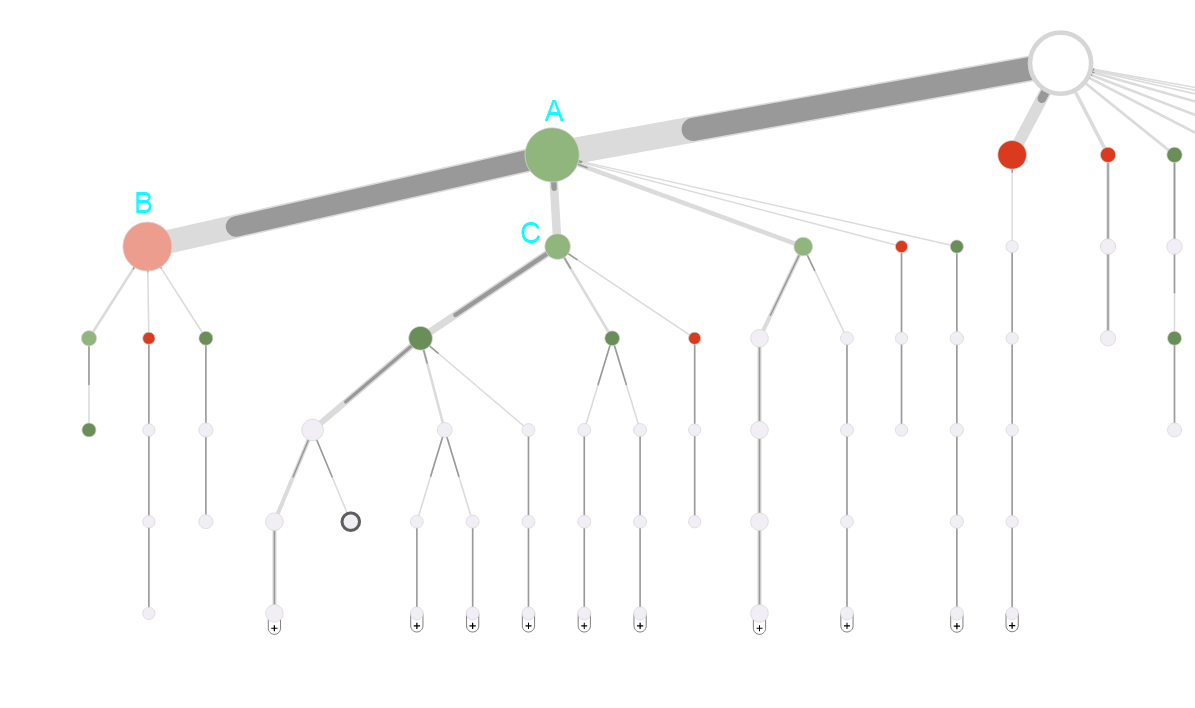
- Nodes
These are depicted as circles and represent pages (they could represent other attributes too but more on that later) - Paths
These are depicted as a sequence of circles and the connecting lines between them, and they represent a sequence of pages (or marketing elements) that users have viewed and navigated through
Nodes and paths have visual properties that provide information about them:
- The size of a node indicates the total engagement value of the node and all its descendants
Node A is larger than node B indicating that the total engagement value on node A and its descendants is higher than that of node B.
- The color of a circle indicates the value per visit of a node compared to the value per visit of its parent and it helps you spot the change in this metric when looking further down the path. Red indicates decrease while green indicates increase
Nodes B and C are sibling nodes (both descend from node A). Node B is red indicating that the value per visit is lower than that of A. Node C is green indicating that the value per visit is higher than that of A. Note that node B is larger in size than node C indicating that the total engagement value of B and its descendants is higher than that of C.
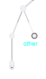
- Circles with a thick dark gray border represent a collection of less significant nodes. This type of node is labelled as other
- The thickness of the connecting line between node A and node B represents the amount of traffic that travels from node A to node B compared to the siblings of node B. The same information is represented by the length of the shaded portion of the path between nodes
The line from A to B is thicker and a has a larger shaded portion than that of the line from A to C indicating that more traffic goes from A to B than from A to C.
There are different types of maps. Each type shows a different type of experiences contacts go through or different types of contacts. The most common one is page maps and its subcategories. In these maps all nodes represent pages. We’ll cover types of maps later in this post.
Context Pane
The Context Pane sits at the right side of the Path Analyzer, and it shows more details about the map or the path that is selected. If no path is selected, the pane shows the map overview. If a path is selected, it shows the selected path overview. You can choose to show or hide the context pane using a button in the control bar.
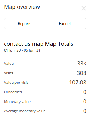
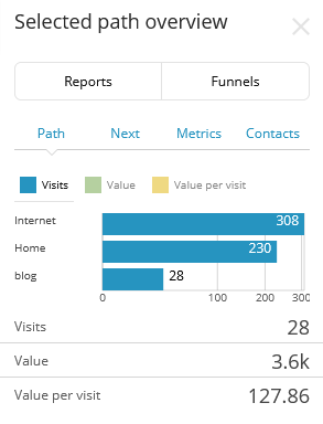
At the top of the Context pane, there are two tabs: Reports and Funnels. Clicking on either of these while a path is selected will unselect the path and bring you back to the map overview so you can select a different path.
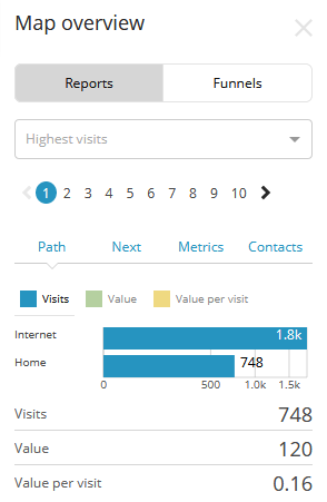
The reports tab shows the topmost paths of the map in various categories. This is super helpful in identifying good and bad paths quickly. By default, there are eight report categories available. Up to 10 paths are available for selection in each category.
- Highest visited – the paths that have the highest traffic
- Highest valuable – the paths that generate the highest engagement value
- Highest visits and value - the paths that generate the highest engagement value and visits
- Highest value per visit - the paths that generate the highest value per visit
- Paths without value – the paths where users exited without generating any engagement value
- Highest exit value potential – the paths that have the highest exit value potential
- Highest outcomes - The paths that generate the highest number of outcomes
- Highest monetary value - The paths that generate the highest total monetary value, which comes from outcomes
You can select a path from the list in reports and view more details about it in 4 tabs: path, next, metrics, and contacts. Alternatively, you can select a path from the map and view the same details as above. This switches the context menu to the selected path overview.
Funnels are well-defined sequences of steps that customers are expected to take on their way to realizing a business objective. They enable you to analyze the actions and paths that customers take on their way to converting goals and outcomes. You can then optimize the paths to improve conversion rates, for example, by implementing personalization or testing. There are no defined funnels by default, and businesses define their own based on the goals they want to track. We’ll cover funnels in detail in a future post.
Back to maps and their types
By default, there are two types of maps in the Path Analyzer:
- Page maps
In these maps all nodes represent pages in your website- Goal maps show how users are moving through pages leading to triggering a particular goal. They disregard pages that were visited after that goal was reached
- Asset maps show how users are moving through pages leading to downloading a particular asset. They disregard pages that were visited after that asset was downloaded
- Campaign maps show how the users that arrive at your website from a particular campaign are moving through pages
- Channel maps show how the users that arrive at your website through a particular channel are moving through pages
- Outcome maps show how users are moving through pages leading to a particular outcome
- Experience maps
Unlike the page maps, experience maps can include nodes that do not represent pages but rather other interaction attributes, such as channels, campaigns, goals, events, and outcomes. Experience maps that are available by default are:- Experience map with goals
- Experience map with value goals only
- Experience map with page events
In addition to the types of maps that are available out of the box, you can create your own maps in the Marketing Control Panel
The Control Bar
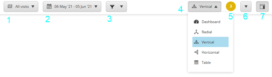
The control bar is at the top of the Path Analyzer, and it is where you control the following:
- Select the map you would like to analyze from the selection of maps that are available
- Select the date range >
- Apply filters to show only a subset of the map selected
- Select one of the map view modes that are available: Radial, Vertical, Horizontal, Table, and Dashboard
- See messages if there are any
- Export the data as CSV or copy it to the clipboard
- View/hide the context pane
The Label and Legend Controls
In the bottom-left corner of the Path Analyzer, there are two buttons that allow you to:
- Show/hide node labels on the map
- Show/hide the map legend

And there you have it, a quick overview of Sitecore’s Path Analyzer that will hopefully get you to explore the application and get a better understanding of how users are interacting with your website. This will be the basis for developing insights and taking actions to optimize and improve, which will be the topic of a future post.